
Solutions & Applications
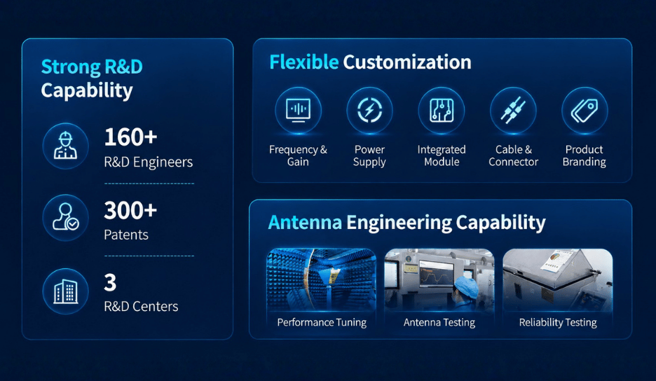
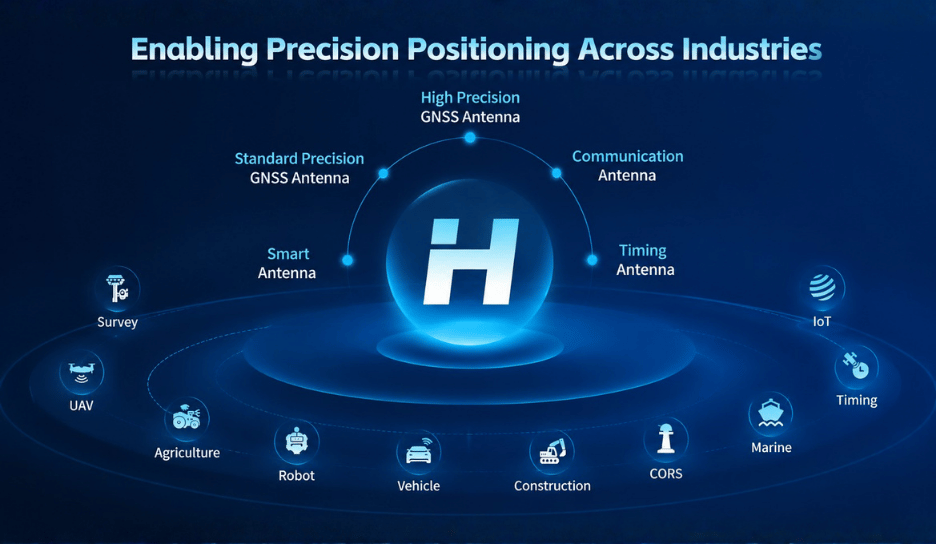
Harxon provides comprehensive GNSS antenna solutions covering high precision GNSS antennas, standard precision GNSS antennas, communication antennas, smart antennas, timing antennas, anti-jamming antennas, and customized solutions. With extensive experience in antenna technology and application development, Harxon’s products are widely used in surveying, UAV, precision agriculture, vehicle, robotics, construction, marine, timing, and IoT applications, supporting accurate positioning and reliable connectivity across diverse industries and environments.